Trailmarker Caps
Typography Design: The Creation of Trailmarker Caps
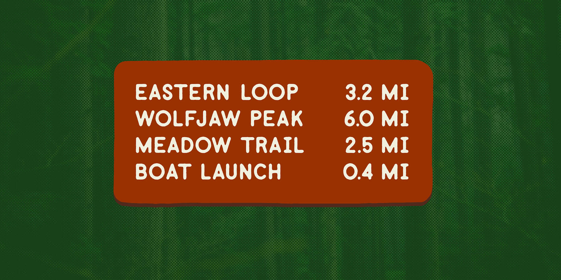
Trailmarker Caps was born out of a request to design a unique typeface for a coffee shop with a “going for a hike with your kids” aesthetic. Although the shop never launched, the process of creating this rugged yet playful typeface became a passion project. Drawing from my lifelong admiration for the router-cut lettering found on trail signs across the country, I designed Trailmarker Caps to evoke a sense of adventure and durability.
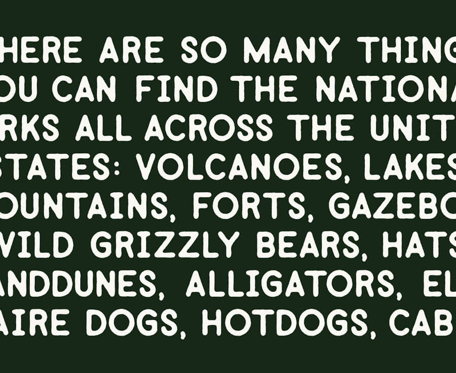
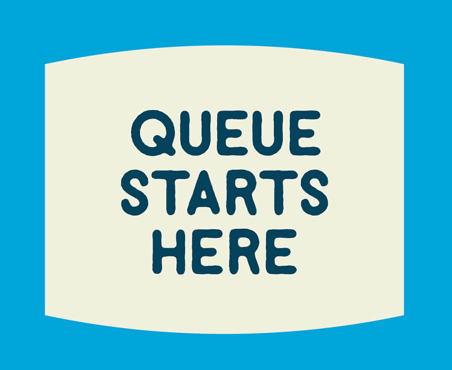
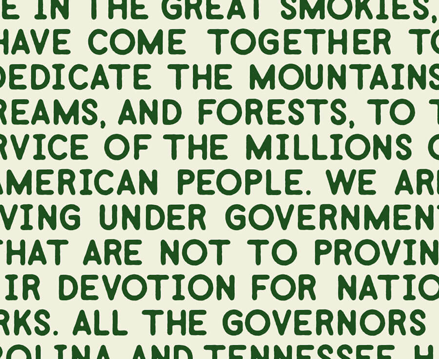
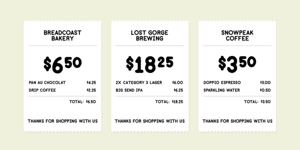
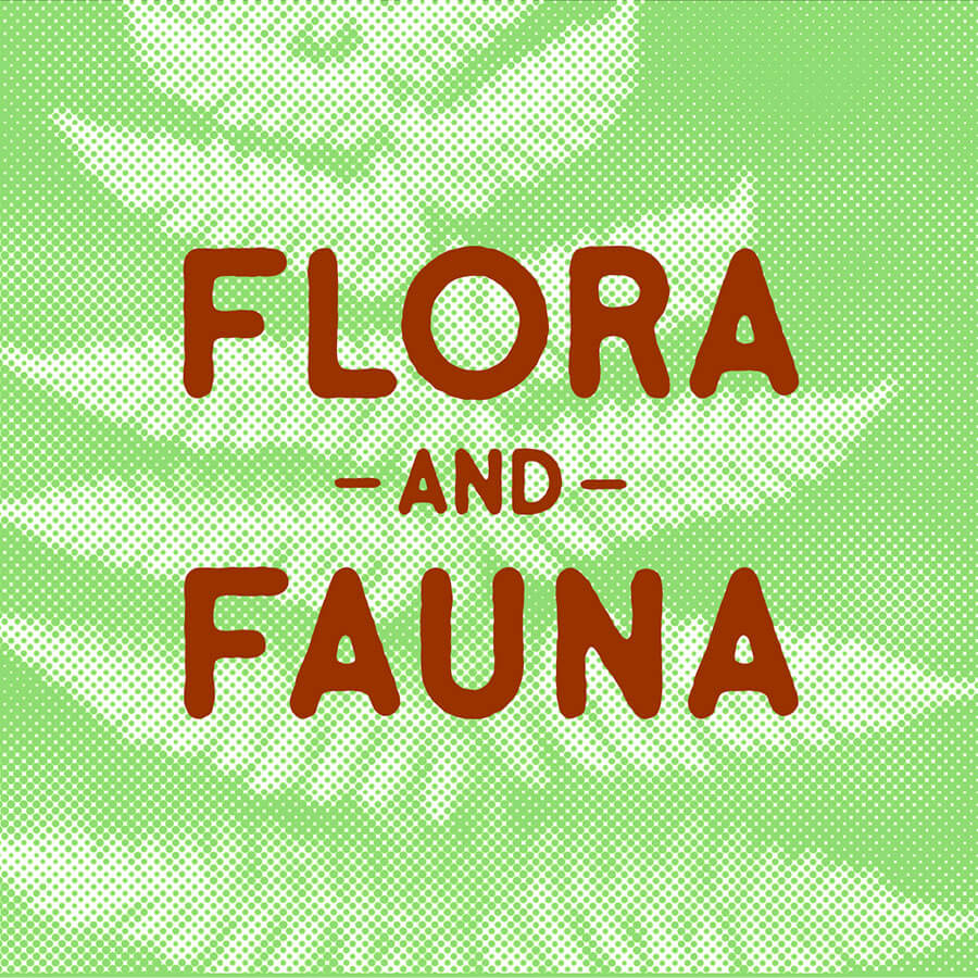
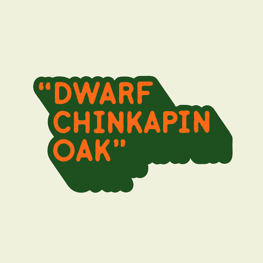
This display typeface combines boldness with readability, making it versatile enough to stand out in large headlines while maintaining legibility at smaller sizes. Its robust character and distinct outdoor-inspired style give it the potential to expand into a full type family, complete with lowercase glyphs and text variations that complement the original all-caps design. Trailmarker Caps offers flexibility for brands looking to project strength and approachability, making it a perfect fit for various creative applications.
Explore more of my typography work and diverse design projects in the Design Vault.
